Ocean Dashboard
The Ocean dashboard gives you quick access to insights and summary data over all the Kubernetes Ocean clusters in your Spot account. You can obtain an overview of your current cost efficiency status, insights for potential savings, and detailed breakdowns of your workload cost efficiency across Ocean clusters or aggregated according to Kubernetes labels and annotations.
The dashboard also provides an easy pathway to the actions you can take to implement recommendations and optimize our workload costs.
Relevance
The dashboard is currently available to Kubernetes users only.
View the Dashboard
In the main menu of the Ocean console, click Dashboard.
The Ocean dashboard includes the following main areas:
- Summary Line
- Cost Analysis
- Top Right-Sizing Recommendations
- Pending Recommendations by Cluster
Summary Line
The summary line provides insights into your recent node usage and potential savings you could achieve with further optimization.

- Ocean Managed Nodes. Shows the number of instances managed by Ocean vs. the total number of instances in your cloud infrastructure registered to the kubernetes clusters. To see a breakdown per cluster, click on the numbers. This provides detailed information and an easy pathway to migrating unmanaged nodes into Ocean.

- Month to Date Savings Percentage. Shows average percent savings achieved in the current month by managing your instances in Ocean.
- Month to Date Total Saved. Shows total savings dollar amount achieved in the current month by managing your instances in Ocean.
- Month to Date Missed Savings. An estimate of additional savings that could have been achieved in the current month by migrating all the remaining unmanaged instances to Ocean spot instances. This is an estimation only, and the actual amount realized will depend on the individual use case.
Cost Analysis
This part of the dashboard enables you to see breakdowns of costs across all your Ocean Kubernetes clusters. You can analyze per cluster or per Kubernetes labels and annotations.
The cost analysis is presented in two formats, a bar chart and a detailed breakdown table. There are several ways to filter and group the data to create a view that best fits your analysis requirements.

Filter and Groupings
You can apply the following types of filters and groupings to the bar chart and breakdown table:
- Time. Choose a time frame for your cost analysis snapshot. The default is the last week.
- Clusters. Choose which clusters to include in the analysis. Can be all clusters or a subset. The default is all Kubernetes clusters in Ocean.
- Group by. You can break down the costs in the following ways:
- By Cluster
- By Label (Namespace)
- By Annotation (Namespace)
- By Label (Resource)
- By Annotation (Resource)
When you group by Kubernetes label or annotation, the costs are displayed across all clusters that include those labels or annotations.
For more detailed information about using Time and Group by settings, see Cost Analysis.
Bar Chart
The bar chart shows the cost of your workloads over time. The default display is that each bar is broken down into the different clusters and represents the cost per day over the last week.
Breakdown Table
The breakdown table presents an itemization of costs per component (e.g., cluster, label or annotation) and costs within each component. Items include the following:
- [Component] Name. Name of the cluster, label or annotation in each row displayed.
- % of total costs. Cost of the cluster, label or annotation as a portion of the total of the entire Ocean cluster
- Compute. The portion of the cost for computing
- Storage. The portion of the cost for Kubernetes persistent volumes and instance volumes
- Spend. Total cost of that cluster, label or annotation
To see the detailed cost analysis for a specific component (e.g., cluster, label or annotation), click on the name in the breakdown table. Ocean will display the detailed Cost Analysis page for that component.

Top Right-Sizing Recommendations
The dashboard displays a summary of top right-sizing recommendations. This includes:
-
A trend summary of the recommendations that you have activated in the last 30 days.
-
A description of the top 10 recommendations yet to be implemented.
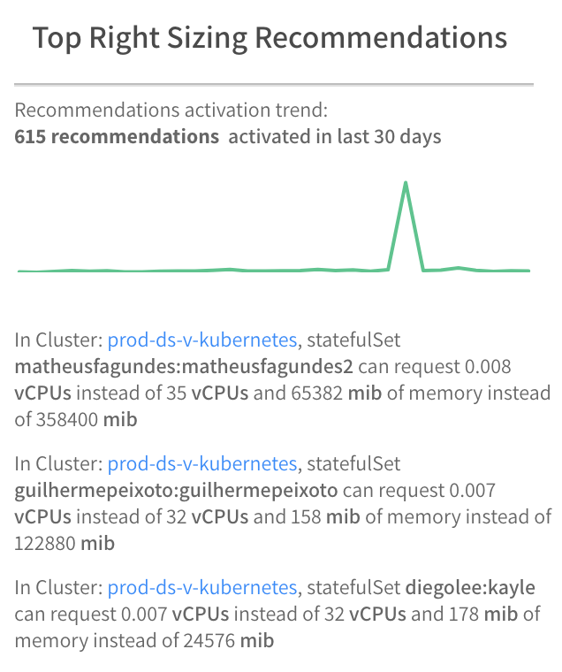
Ocean sorts the list of recommendations so that the most cost effective ones in dollar value appear at the top. Most cost effective means an instance that has the potential for the most dollar savings by right-sizing the CPU and memory resources. For each instance, Ocean calculates a weighted average delta which represents the recommended changes in CPU and memory. The instance with the greatest weighted average delta has the potential for the most dollar savings.
Pending Recommendations By Cluster
This table shows a summary of recommendations per cluster that have not yet been implemented. The clusters are listed by default in order of least to most efficient.

The table includes the following information:
- Cluster. Name of the cluster.
- Current Efficiency. Efficiency score as a percent. Ocean calculates this score based on the gap between the right-size values for workloads as generated by the Ocean right-sizing algorithm and the actual resource request values set in the cluster. CPU and memory resources are weighted equally in the total score.
- Activated. Number of instance recommendations that have been activated already.
- Pending. Number of instance recommendations that have not yet been activated. For more detailed information about the recommendations, click on the number. The detailed Right Sizing analysis for that cluster will appear.